Smartphone applications for farmers — insights on design-related challenges
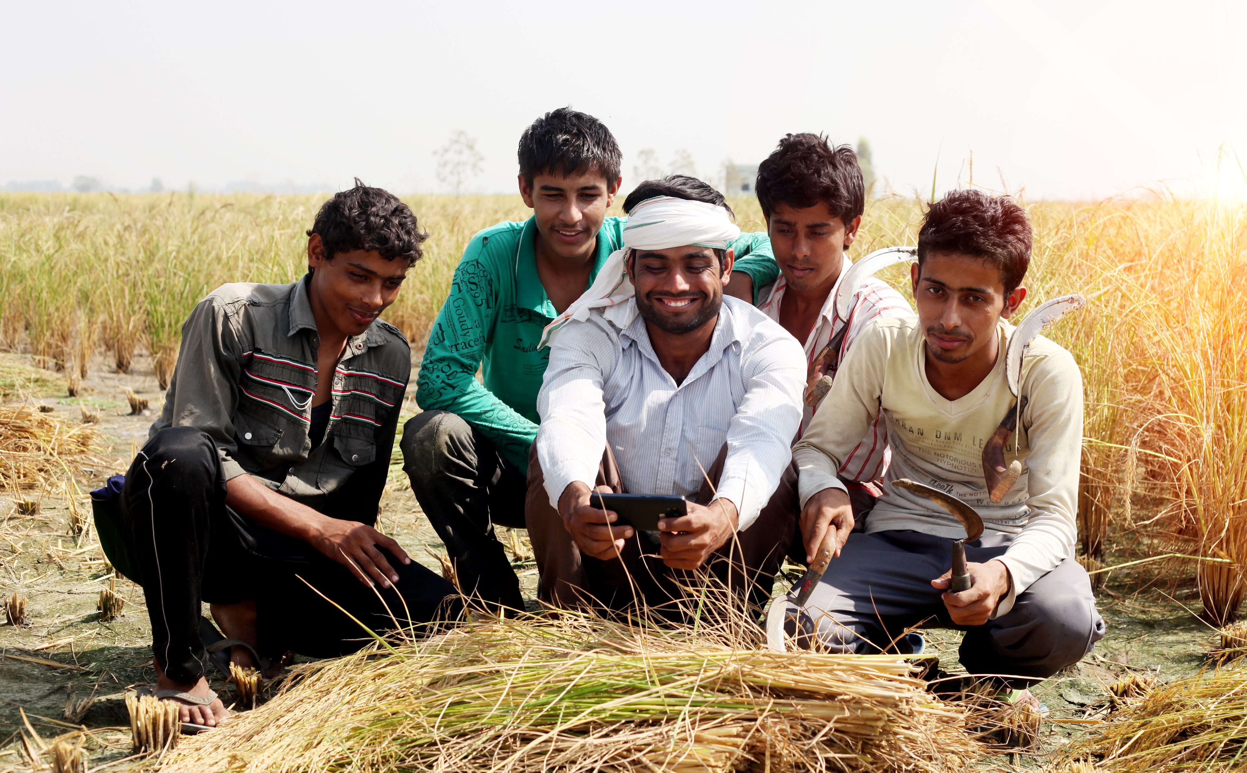
Image by Sonia Dhankhar on Shutterstock
In our previous blog post, we highlighted the case of farmers who use their smartphones to access entertainment/social media applications (see Figure 1) but at the same time cite lack of digital literacy and familiarity with technology as barriers to adopting digital agricultural/financial services. In general, this is consistent with existing research on the topic, which finds that non-literate populations avoid complex functions, and “primarily use phones for synchronous voice communication only” [Chipchase, 2005].
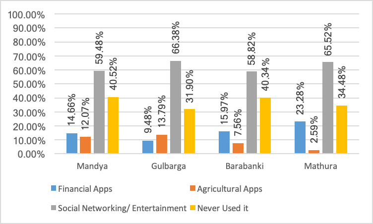
Figure 1. Type of Apps Used by Participants
In this post, we further detail the various challenges faced by farmers using app-based services, by exploring our data from Karnataka [1] and Uttar Pradesh [2]. In each of our study areas, we introduced farmers to two app-based agri and financial services that are available in the local language, and observed their interactions with the same. Among other things, a key objective of this exercise was to assess the various design related challenges that were being faced.
Across study areas, we note two challenges in particular (see Figure 2):
(1) respondents finding app interfaces to be ‘complex’, and
(2) steps involved in setting up of applications on smartphones being complicated.
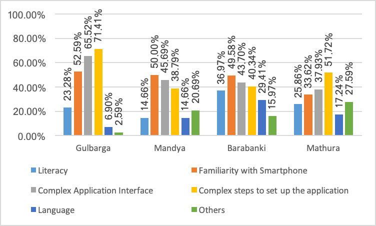
Figure 2. Major Challenges
While literacy and familiarity with smartphones [3] (or lack thereof) are important barriers that can make app usage difficult, it is important to note that design related challenges are as commonly observed, thus highlighting the need to address them as well. Indeed, this fits well with the distinction highlighted by Thies (2014), wherein non-literacy challenges could include the ability to transfer learning, or the ability to navigate hierarchical organization of information architectures (Medhi et al, 2012).
In order to further substantiate the point, we also examine what aspects of the application interface the farmers find most complex. For example, we gather data on whether the farmers are able to recognize important functions on the main screen of the apps. In other words, we examine whether the various icons on the application home page, (weather, news and online shopping etc.) are easily understood by our respondents. In general, we find that our respondents are unable to successfully understand the iconography involved, with a majority requiring some level of assistance. We see an exception in the case of Mandya, where a large number of our sample respondents are able to perceive and understand the various icons and related functions mostly unassisted. We are currently exploring this further to better understand this particular finding.
We also observe that farmers with a higher level of education perform much better on this task (see Figure 3). The percentage of farmers who find it challenging to perceive the meanings of the icons, and understand the underlying functions declines progressively, as the level of education increases. This trend is consistent across all districts. Again, our observations fit the narrative presented by prior studies. For example, studies (see Van Linden and Cremers, 2008, etc.) show that the level of formal education significantly influences a number of cognitive skills, including language processing, visual organization and visual memory. For one, all this goes to highlight the critical need to consider design as a crucial aspect of making technology accessible to low-literacy users, and secondly, emphasizes the need to account for the large heterogeneity in cognitive skills of users.
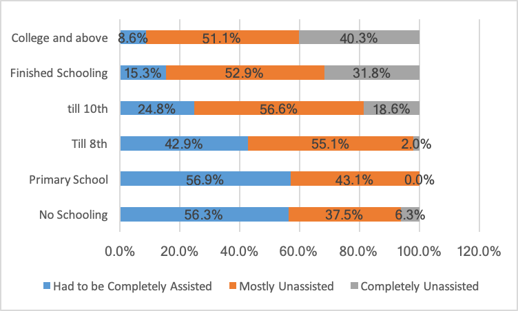
Figure 3. Sample Performance — Recognition of Important Functions by Education
In addition to education, we also observe that age appears to influence the ability to understand icons, and their underlying functions better. In general (Figure 4), we see that the challenges faced by our respondents in this regard are highest for the oldest participants, while the youngest participants required hardly any assistance.
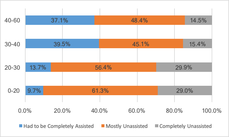
Figure 4. Sample Performance — Recognition of Important Functions by Age
Furthermore, we tested the ability of our respondents to navigate through various screens of the app, and to find the location of specific functions [4]. We proceeded with this in the following manner — first, we demonstrated how to register with the application, and navigate to a screen in the app, which allowed the respondent to check price information from the local mandi for a set of crops. In line with the trends observed earlier, we discovered that most of our respondents find it difficult to navigate through the app. Similarly, the trends regarding age and education highlighted above seem to persist here as well.
Overall, we thus see that demographic characteristics like age and education do influence app usage in tangible ways. As we mention earlier, these findings relate well to prior research on the topic. At the same time, our study attempts to move beyond more general discussions around what is a well-designed app, to gather data on how specific design features influence usability of apps. In our last phase of the study, we will be gathering more information on aspects of design/ design elements that could help in overcoming some of the barriers highlighted for low-literacy segments. More on that shortly!
Notes:
- Districts in Karnataka- Gulbarga and Mandya
- Districts in UP- Barabanki and Mathura
- In literacy, we look at the ability of the farmers to read and understand the language of the app. In technical knowledge/ familiarity with smartphone, we look at the general level of expertise of farmers to use basic functions of a smartphone.
- To understand the ability of participants to find the location of a function, other than navigation, we also look at whether they are able to move from one step of a function, like checking mandi price, to the next by locating the arrow or any other button for that purpose. Similarly, we also look at whether they are able to find other buttons to move from one step to the next of a function or complete a function.
References:
- J. Chipchase. Understanding non-literacy as a barrier to mobile phone communication. http://www.kiwanja.net/database/document/report_ literacy_barrier.pdf, 2005.
- I. Medhi Thies. User Interface Design for Low-literate and Novice Users: Past, Present and Future. Foundations and Trends R in Human-Computer Interaction, vol. 8, no. 1, pp. 1–72, 2014.
- I. Medhi, M. Lakshmanan, K. Toyama, and E. Cutrell. Some evidence for impact of limited education on hierarchical user interface navigation. In ACM Conference on Human Factors in Computing Systems. 2013
- I. Medhi, S. R. Menon, E. Cutrell, and K. Toyama. Correlation between limited education and transfer of learning. Information Technologies and International Development, 8:51–65, June 2012
- S. Van Linden and A. H. M. Cremers. Cognitive abilities of functionally non-literate persons relevant to ict use. In International Conference on Computers Helping People with Special Needs, pages 705–712. Linz, Austria, July 9–11 2008.
This research was developed as part of the Bharat Inclusion Research Fellowship.
